What makes a Good Fantasy Book Cover?
Ollie Ander
Is probably just a couple cats in a trench-coat—the hair shedding and sunlight napping are highly suspect.
They say to never judge a book by its cover… but we do—it’s human nature! Even if we’re not judging an unappealing cover as a reflection of the contents inside, seeing a stunning cover makes us want to pick it up! In an age with abundant access to resources and extremely talented freelance artists, there isn’t much of an excuse left to have a "bad cover," but if you’re an overwhelmed indie author in charge of your own visuals, how do you know what makes a good cover?
Every aspect that makes a good fantasy book cover can also unfortunately make it a bad one. Below is a list of visual aspects to consider for your fantasy cover, their appeal to readers, and some pointers on the ways that sometimes a "fire cover" can backfire. I’ve included examples of covers that successfully implement these things, dissecting how/why their communication is so effective.
Set Expectations with Your Fantasy Cover
Saying that your cover should "hit expectations" can mean two very different things in publishing. On one hand, "market expectations" are the consensus of the genre (visually, in this case): what readers typically look for and find when buying in that area.
On the other, more important hand, you should set the expectations of YOUR book through its cover—not to cater to the genre en masse, but to show the specificities of your story.
What’s unique to your book that sets it apart from other fantasy books? Market that—front and center, on the cover! Set your readers’ expectations FOR that. Make it so that when readers look at the beautiful cover of your book they know what they’re going to get and how it is going to be different.
More than other genres, fantasy book covers function as a sale’s pitch. Sure, romance covers feature pictures of a couple, but that’s expected, in fantasy you can pitch your magic through visuals.
Do you have a sprawling fantastical world to explore, mythical creatures, dangerous adventures, high stakes? Show it! Pull readers in by making that promise with your cover.
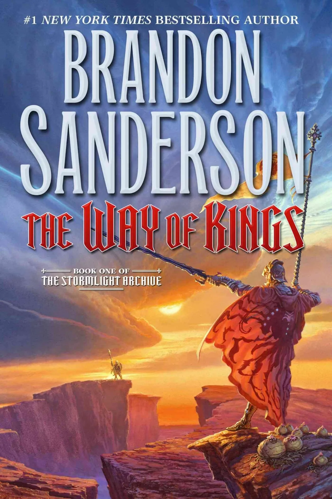
"The Way of Kings" by Brandon Sanderson being the first installment in The Stormlight Archive, its cover routinely makes the rounds across the bookish sphere upon each new release—and it holds UP!
Readers are shown a barren but beautiful landscape in brushstrokes of contrasting oranges and blues: aptly, the story is set in a world that is indeed harsh and dominated by sweeping storms. Not only is there an unnamed protagonist shown who will lead us through that, but another; someone off in the distance. An enemy, an ally? The metaphor of the canyon divide is powerful imagery.
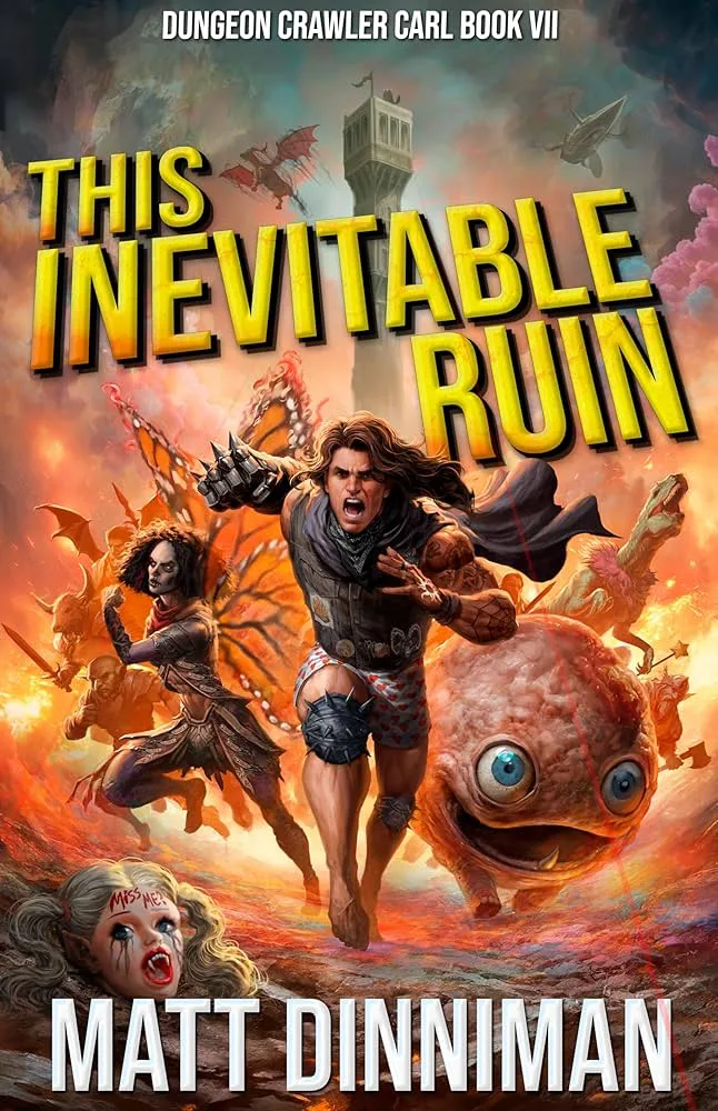
The Dungeon Crawler Carl book series by Matt Dinniman makes promises in action and specificity. Being so popular, there are different book cover releases, but this one stays true to its nature and intrigues ME the most! There’s so much going on to want answers to: why is he missing his pants, who are those delightful sidekicks, what are they running from, and, as a returning reader to the franchise, what mischief is that creepy vampire doll head going to cause?
Don’t Overpromise
The dangerous side of this coin is advertising something that’s not in your book—at least not to the expectations set by the cover. If there’s sprawling landscapes across your dustjacket but the majority of the novel is spent in a dingy cave, you’ll lose readers’ trust.
There are so many incredibly talented fantasy artists out there that can bring even the most mundane scenes into stunning renditions, so don’t overshoot. It’s better to have readers appreciative of what your story provides than be disappointed because they were overpromised on an adventure you couldn’t fulfill.
Trope Market with Your Cover
If your strategy is to get associated sales (in algorithm book recs, or bulk purchases) then you should niche down. Look into the visuals expectations for the specific subgenre of fantasy you’re in and incorporate those aspects. Market to coexist alongside your peers’ works…for the most part. Even if your cover "fits in" in the general sense, you should always have a strong visual identifier.
Being subtle but deliberate can go a long way.
If readers are presented with a display of a dozen books in your subgenre, what identifier could they use to recognize and ultimately pick yours from the others? Your covers’ identifier is likewise its promise. "It’s THE new dark fantasy with a __ motif."
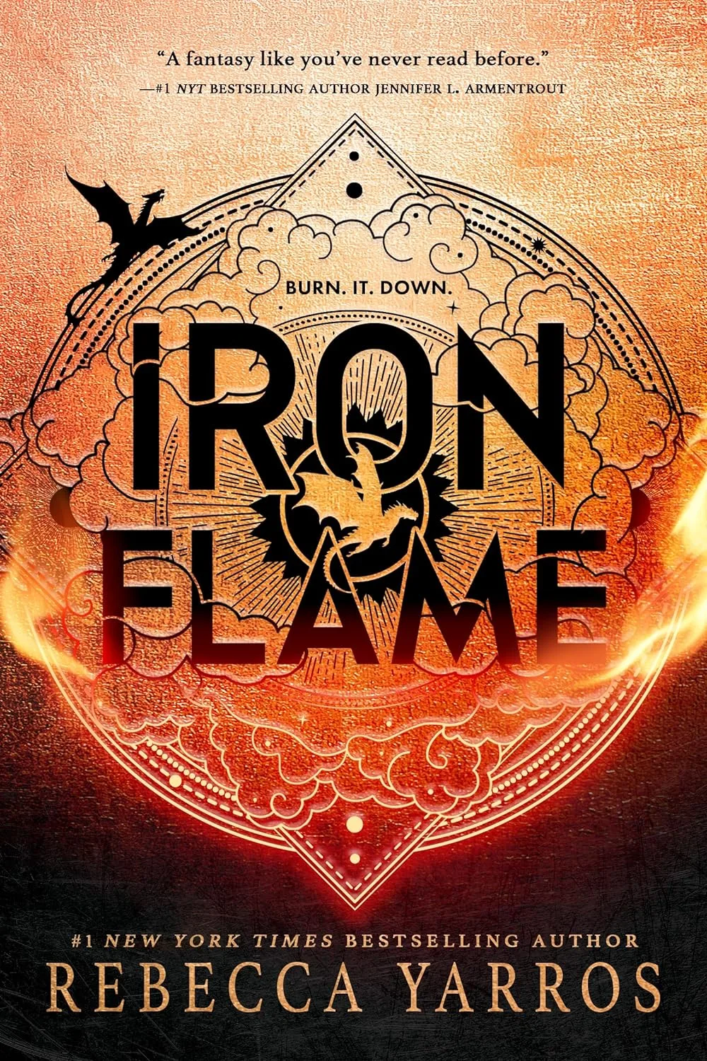
"Iron Flame" from Rebecca Yarros’s series both conforms to its subgenre and hints at its contents. The roughed-up texture contrasts the clean, embossed lines of the design: a book of power struggles and dirty fighting. Its identifier being the hot new romantasy "with dragons," you can find silhouettes of dragons present in the design, and a strong use of flame-orange as the eyecatcher.
Don’t Use Generalized Aesthetics (without intention)
Some subgenres of fantasy are so niched down in their aesthetics, it may feel like you need to follow suit or be kicked out of the club. This can also be seen across other genres (like the cel-cartoon covers in romance), but in fantasy right now it comes in the form of covers with: a rampant flora background, a sword (or some sort of weapon/ object) placed among that, with elegant gilded text atop.
Hopefully one comes to mind—or many. Here’s a small sampling from scrolling "fantasy books" at large on Amazon for three pages. Although "On Wings of Blood" by Briar Boleyn is very intentional with its rich use of red and the subtle inclusion of the form of a dragon, it can still get lost among the competition.
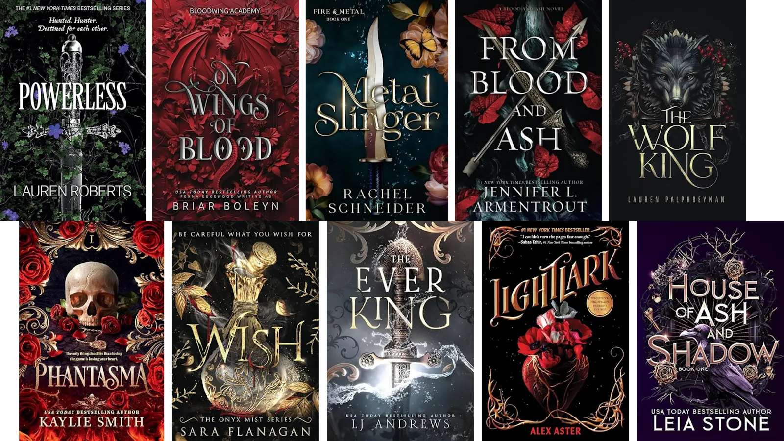
There is also an indistinguishable "sameness" to fantasy books which lean toward elaborate astral or metal-work designs:
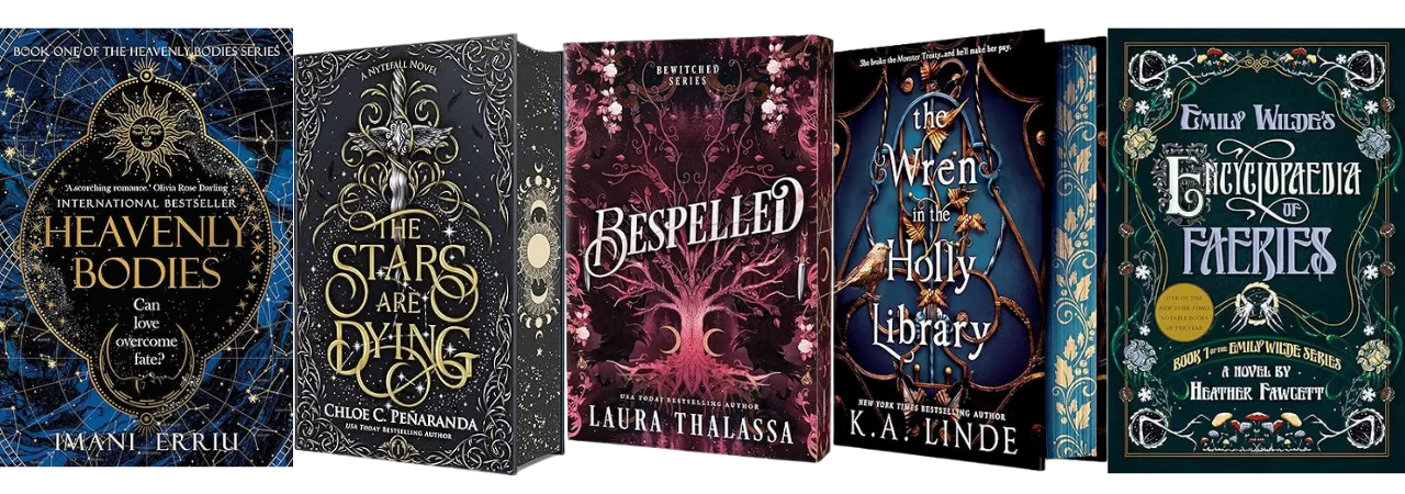
Though those covers are inarguably beautiful, they can stunt your novel sales for two reasons: your cover’s identifier isn’t clear enough, so readers aren’t interested to pick it up among a pile of others that are presumably "just the same." And if it doesn’t share enough tropes of the already established titles with similar aesthetics, avid fans may warn others away with not having met the vibe check.
Be aware of trope marketing and expectations, play into them, but don’t follow one as a free pass if the content of your work doesn’t match.
Show off Your Characters
I would normally caution against using a singular portrait or character art as your cover (as it removes the readers’ ability to transcribe their own interpretations of the characters), but even that can work so long as you include a strong visual of why readers want this version of the character.
What makes your character stand out among usual protagonists (or love interests, for that matter)? Perhaps the appeal is that they already feed into a highly sought trope? In which case, wave readers over with their bold appearance!
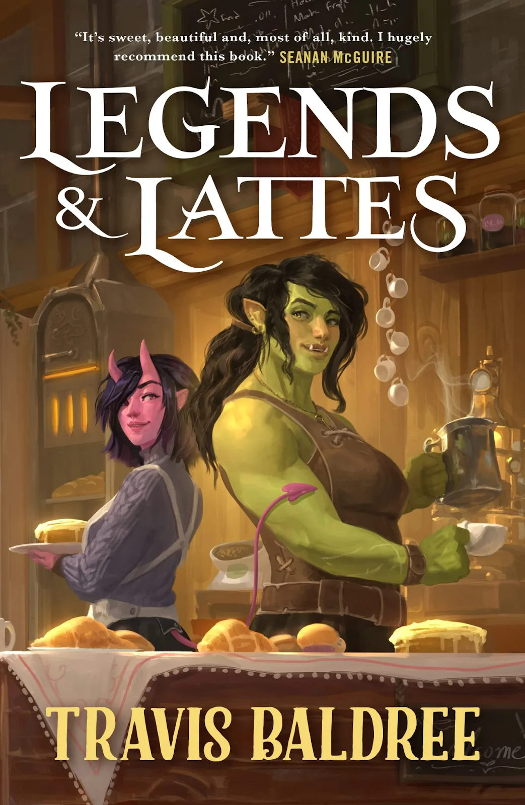
"Legends & Lattes" by Travis Baldree is an excellent use of a fantasy character portrait cover. They’re not just standing there posing for the camera, they’re doing something; they’re doing their things as strong independent business women running a cafe. Not only do you get a glimpse of the personalities you’ll get the delight of meeting in the story, stylistically, with the soft rendering and palette, the promise of coziness is there before you’ve even opened the book.
Don’t Misrepresent
A lot of character covers could be described as "hot but boring," and that’s because they’re seen as safe by publicists. When showcasing a protagonist, if they’re made generic enough, people can still project anything they want onto them—But I’d argue, at that point, what’s the point?
More important though, is portraying a character accurately to what readers will get. Not only does the same apply to the earlier advice that readers won’t be pleased if you lead them astray, promising a main character of a certain gender, race, ethnicity, sexuality, etc. only for that aspect to be basically non-existent in the writing, will ruffle feathers: it’s false advertising. Don’t make your character’s depiction a certain way, only for intrigue.
These are just a few of the many things to consider for your fantasy cover—what will make them great and what could cause them to falter. Use your discretion in what your audience will respond to best, but stay wary of providing false expectations. If this article has you wondering whether a fantasy-forward cover maybe isn’t your best bet, here’s an article on $ Book Cover Trends & Ideas$ to get a feel for exactly what each genre is catering to, going into 2025.
Like what you're reading?
Join other authors like you in NovelPad’s free writing community!
Join the communitySimilar Posts

What File Formats are Accepted by Kindle Direct Publishing?
File types for ebooks, paperbacks, and hardbacks on Amazon's KDP.
Ollie Ander
Is probably just a couple cats in a trench-coat—the hair shedding and sunlight napping are highly suspect.
What’s the Difference Between a Novel and Novella?
What distinguishes the novel from the novella?
Ollie Ander
Is probably just a couple cats in a trench-coat—the hair shedding and sunlight napping are highly suspect.
Do Self-Published Authors Make More Money?
Royalty rates, merchandise sales, ad control, and other ways self-published authors stand to make more money.
Bella Rose Emmorey
book editor, rogue behaviorist, digital marketer, writer, brand builder, plant aunt, and cheese enthusiast.
How To Write Strong Atmosphere In Stories
7 best tips for creating strong atmosphere in your writing.
Hannah Lee Kidder
NovelPad Author
When is the best time to publish a romance novel?
What is the best month and day of the week to publish a romance? Do romance novelists make money?
Rina Fontes Malka
A writer with too many ideas and not enough time.
30 Literary Elements | How to Use Them + Examples
A nearly comprehensive list of literary elements to try out!
Bella Rose Emmorey
book editor, rogue behaviorist, digital marketer, writer, brand builder, plant aunt, and cheese enthusiast.